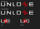

Played around a little bit today. Also, I added a few just for @Metroid Skittles . P.s. submission 5 is probably one of my better ones, crop out the antisemitic stuff at the bottom if you wish.
Attachments

Last edited:









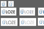


I made the another version where text is as thin as logo.I like the simple idea
But this design feels off for me
The LOSE seems too big for the UN.
Otherwise the global idea is good
Edit : I didn't see the last one
Just the letters UN as a logo is perfect

Yeeess I like it more like thatI made the another version where text is as thin as logo.


Very nice style, I like it.